
Andrew Witherspoon

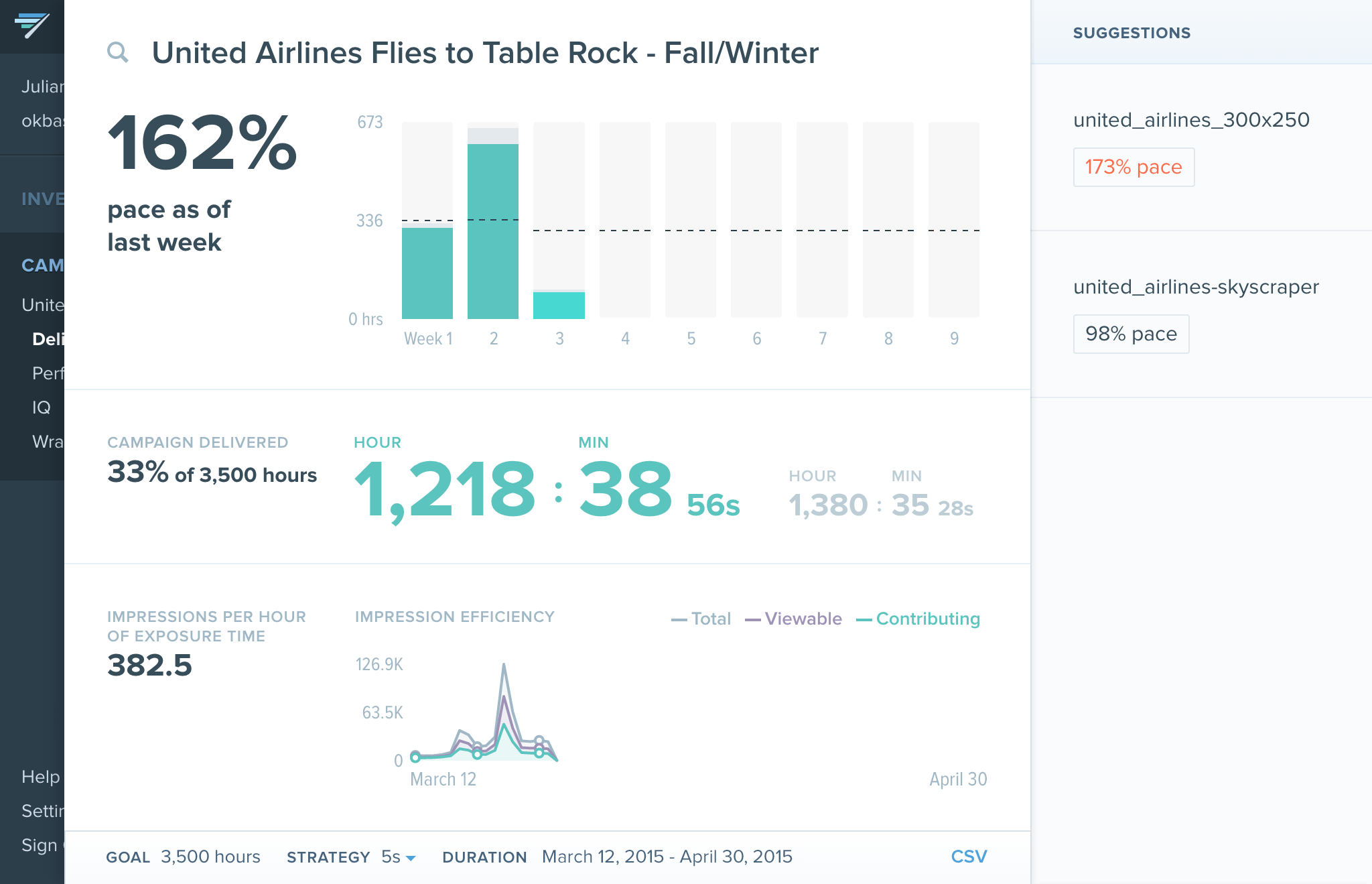 Nº1
Delivery dashboard has two uses: for ad-ops to monitor the pace of campaigns at their desk, and to be cool enough to put on TVs in customer's offices.
Nº1
Delivery dashboard has two uses: for ad-ops to monitor the pace of campaigns at their desk, and to be cool enough to put on TVs in customer's offices.
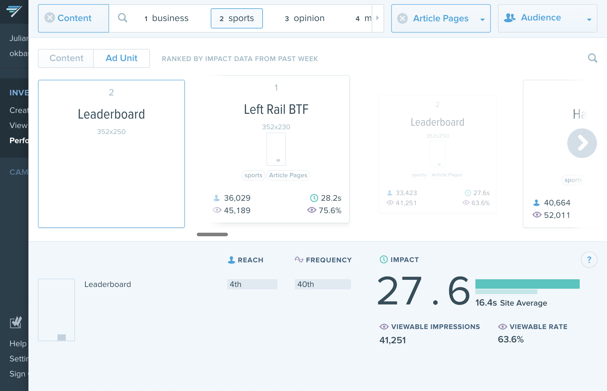 Nº2
A tool for exploring inventory combinations through a set of cards.
Nº2
A tool for exploring inventory combinations through a set of cards.
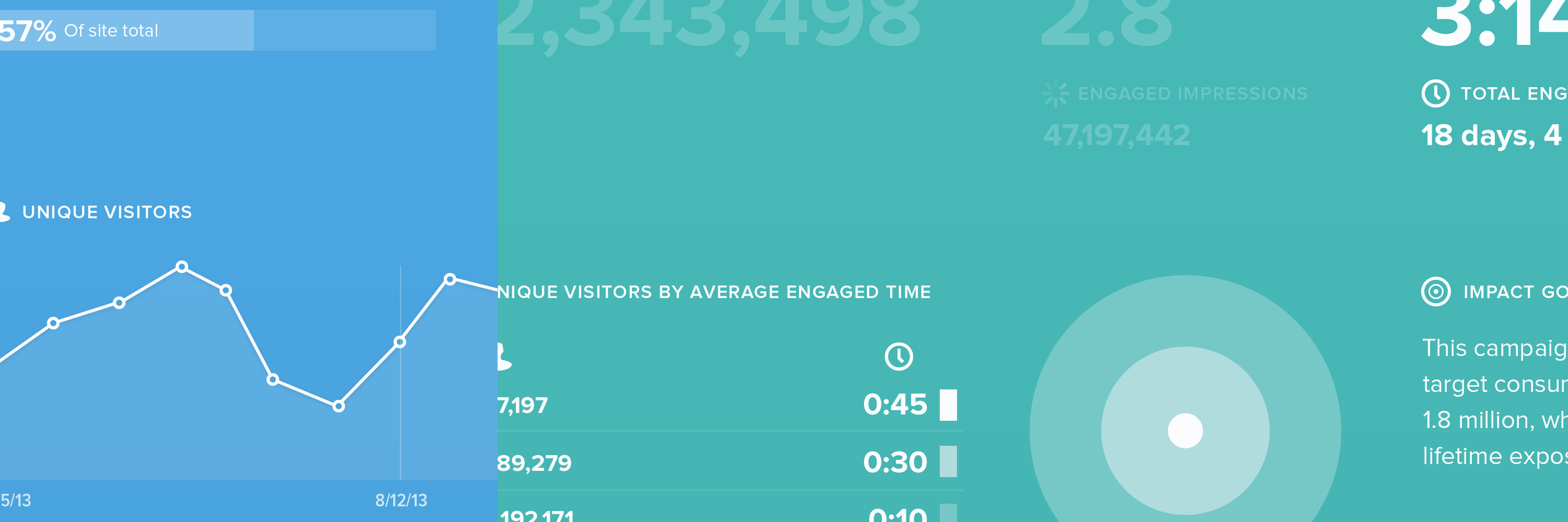
 Nº3
Detail of the Wrap Report view. A tool for sharing results of campaigns with advertisers. A challenge to display data simply but also grab attention.
Nº3
Detail of the Wrap Report view. A tool for sharing results of campaigns with advertisers. A challenge to display data simply but also grab attention.
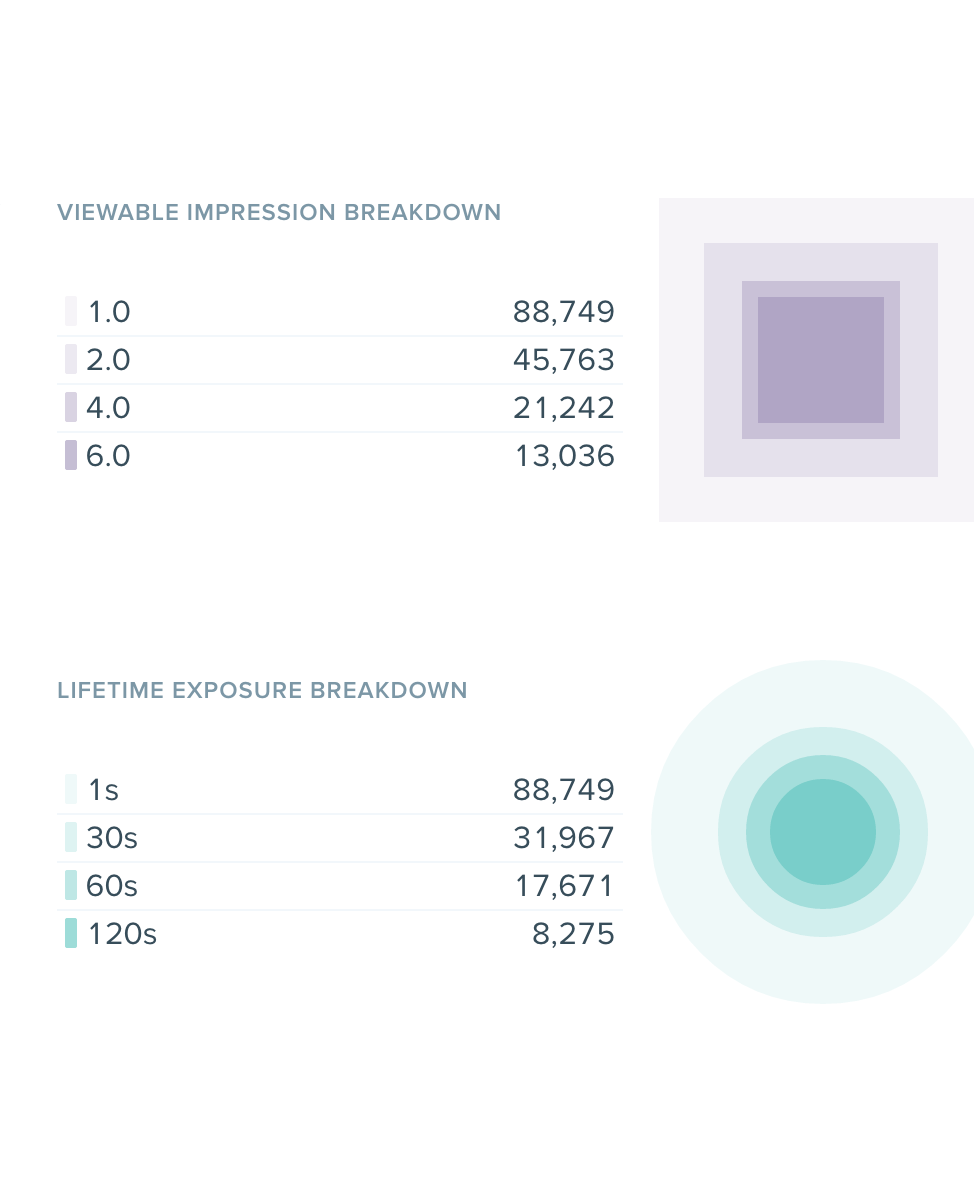
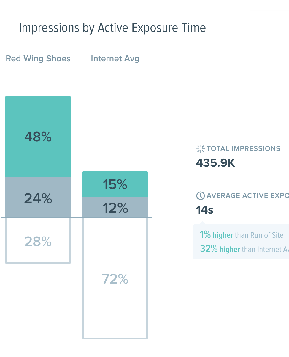 Nº4
Detail of the (internally-named) iceberg graph, a viz to show a campaign's distibution of premium, standard, and non-viewable impressions vs internet average.
Nº4
Detail of the (internally-named) iceberg graph, a viz to show a campaign's distibution of premium, standard, and non-viewable impressions vs internet average.
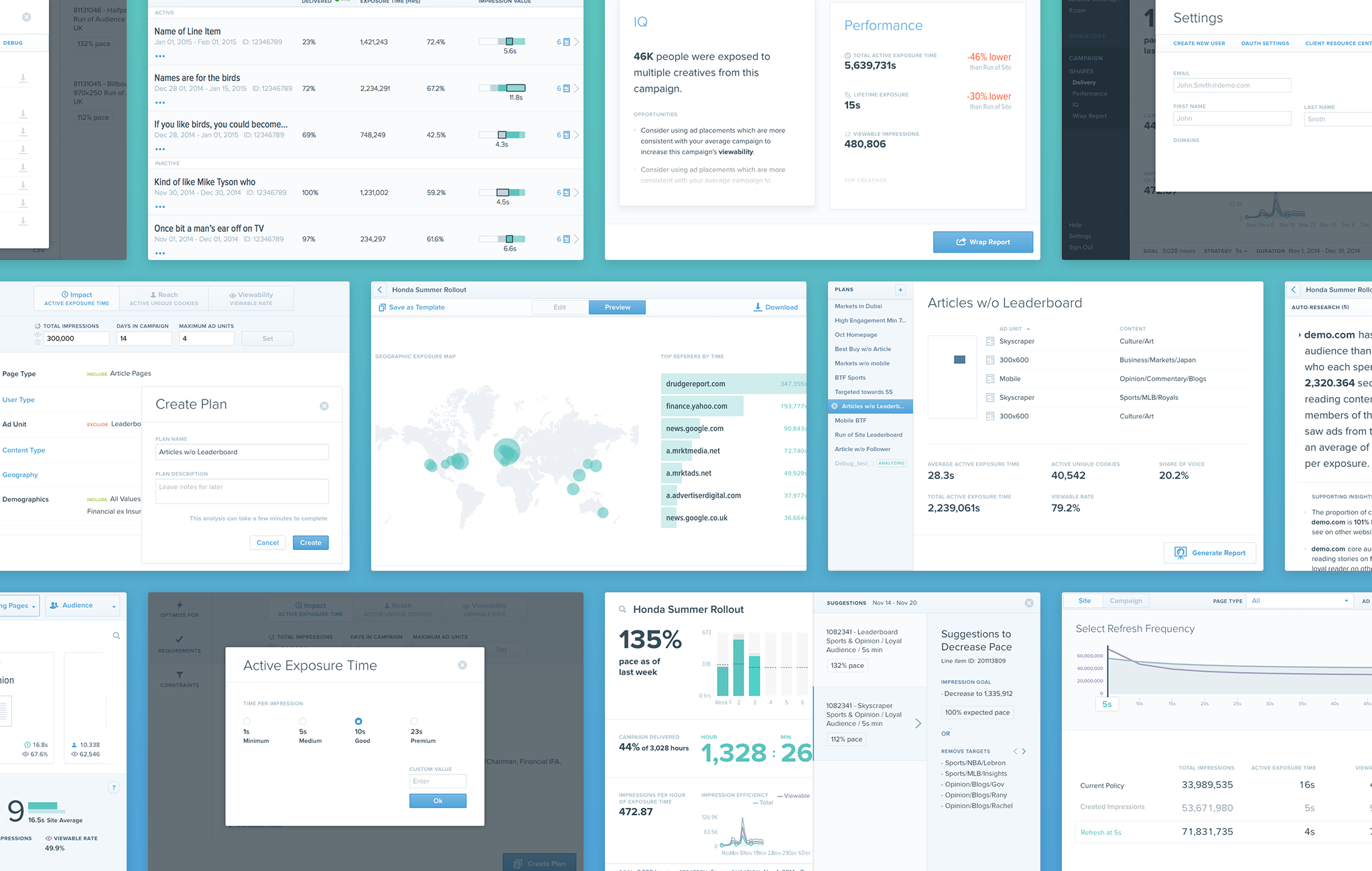 Nº5
Sampling of screens
Nº5
Sampling of screens
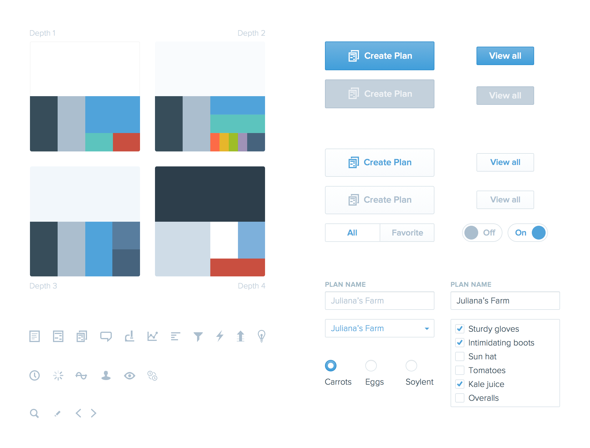 Nº6
UI components. Color chips for the four depth levels (think Material, but simpler), button and form elements, and various feature, metric, and utility icons.
Nº6
UI components. Color chips for the four depth levels (think Material, but simpler), button and form elements, and various feature, metric, and utility icons.
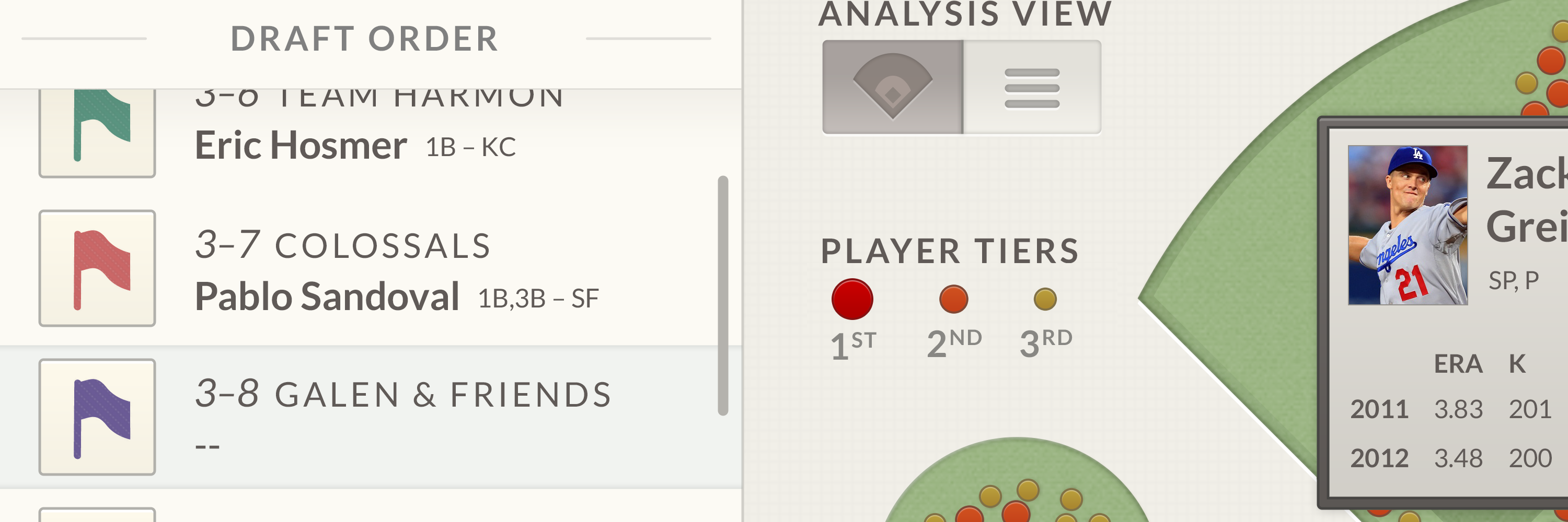
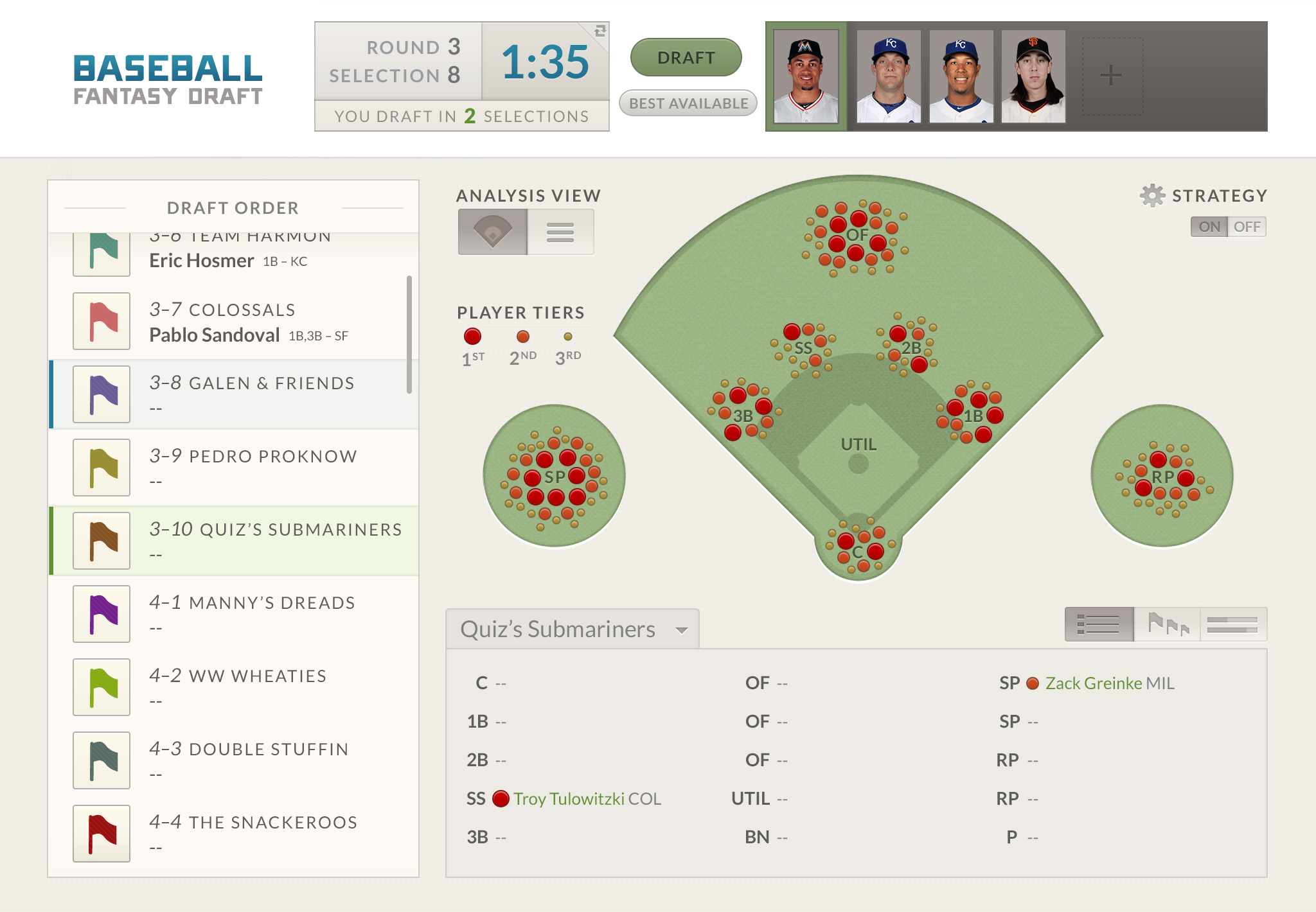 Nº1
Visual ranking system to help identify areas of depth and scarcity by placing players on a baseball diamond.
Nº1
Visual ranking system to help identify areas of depth and scarcity by placing players on a baseball diamond.
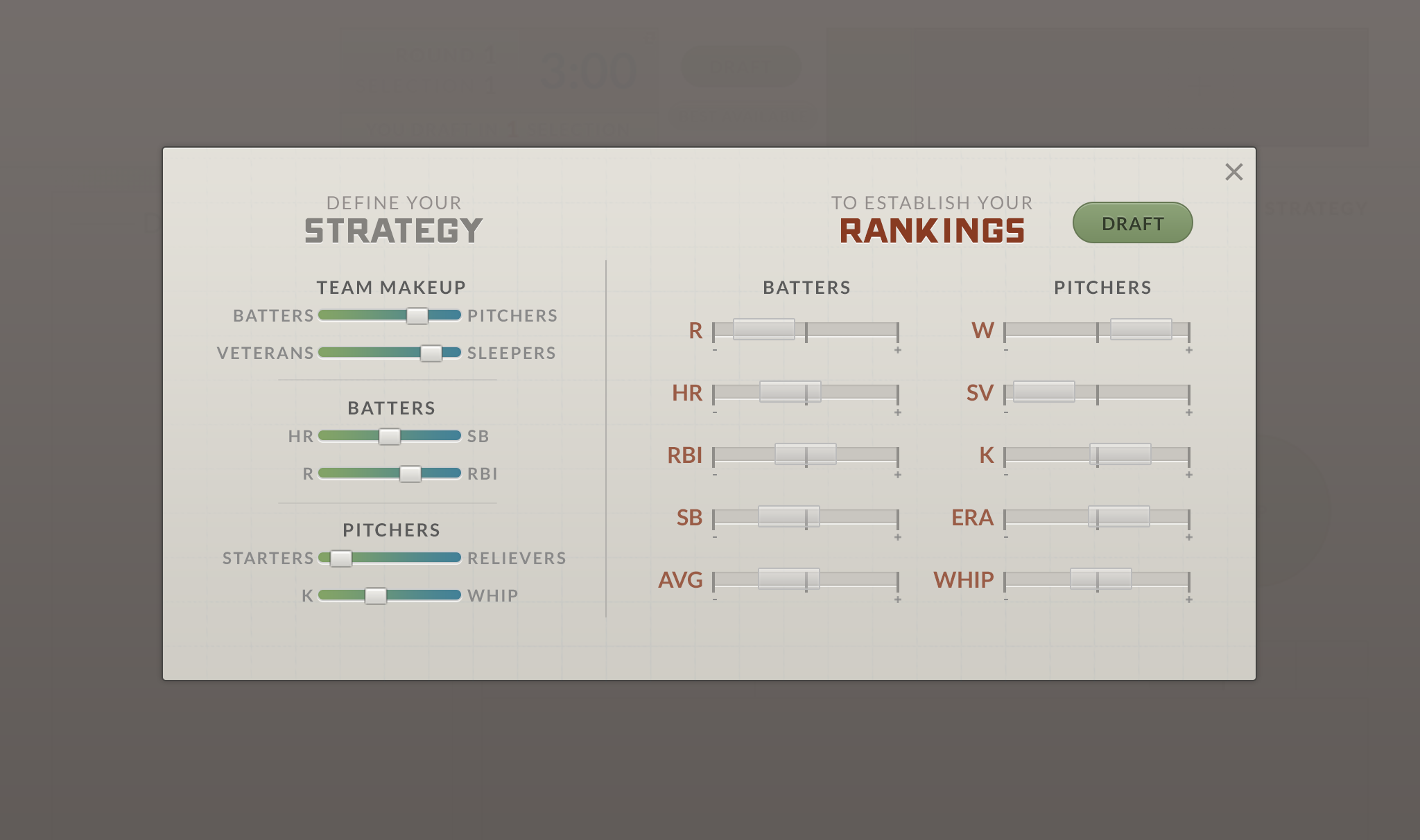 Nº2
Input method for developing a draft strategy. Managers establish player rankings by selecting their categorical preferences.
Nº2
Input method for developing a draft strategy. Managers establish player rankings by selecting their categorical preferences.
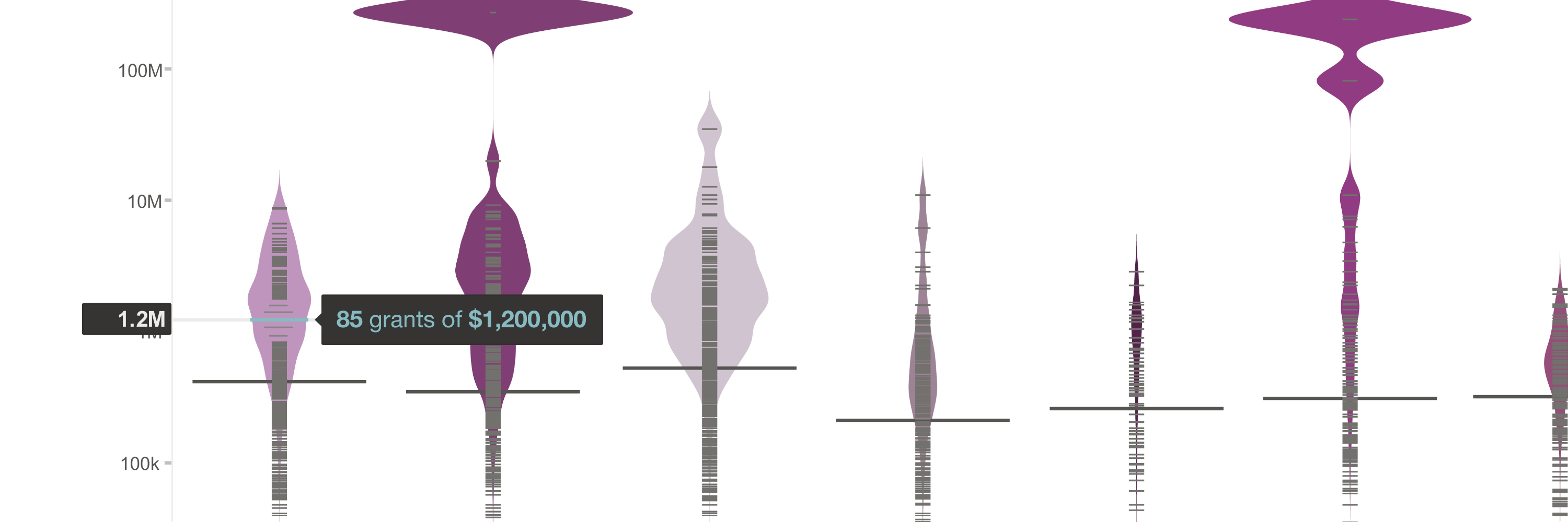
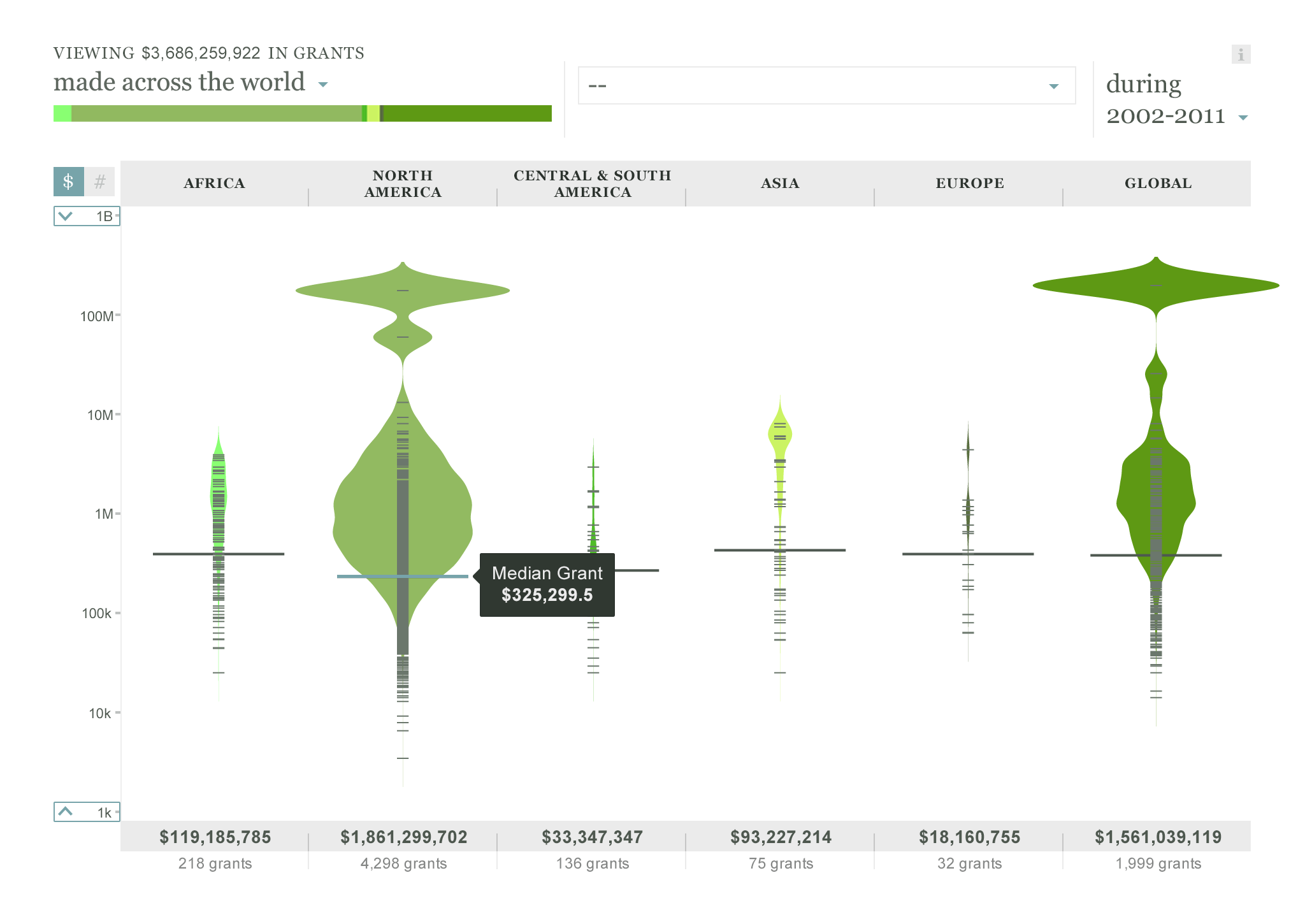 Nº1
Individual values are expressed as tick marks on a vertical axis, while the underlying smoothed bean shape represents the number of grants at that value.
Nº1
Individual values are expressed as tick marks on a vertical axis, while the underlying smoothed bean shape represents the number of grants at that value.
 Nº2
Investigating individual grants
Nº2
Investigating individual grants

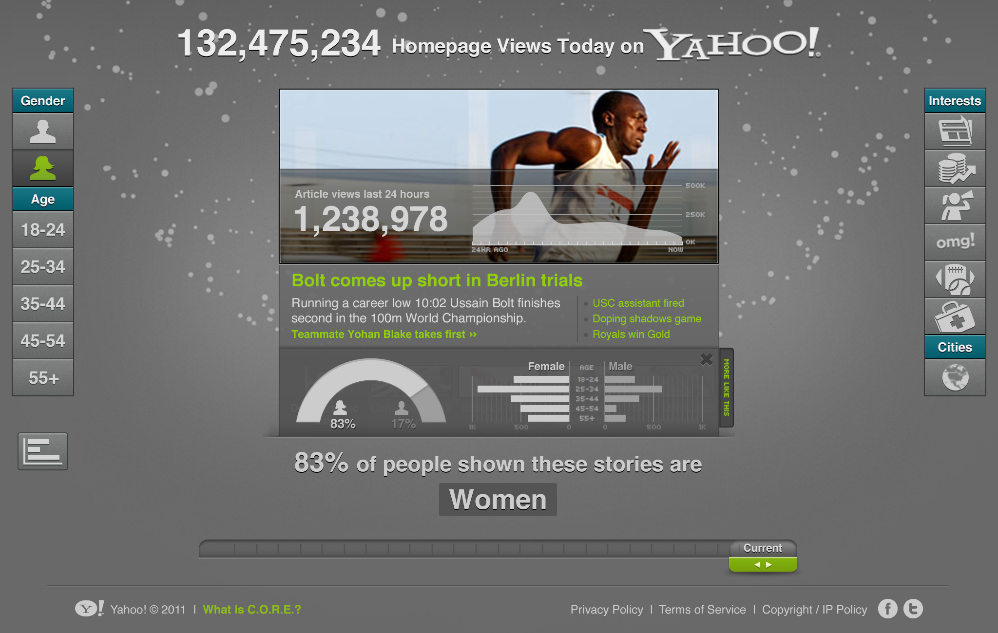 Nº1
A tool to emulate the audience demographic combinations behind Yahoo.com's content recommendation engine. The view is optimized for iPad demonstrations at tech events, for users to see what Yahoo's main content widget displays in real-time.
Nº1
A tool to emulate the audience demographic combinations behind Yahoo.com's content recommendation engine. The view is optimized for iPad demonstrations at tech events, for users to see what Yahoo's main content widget displays in real-time.
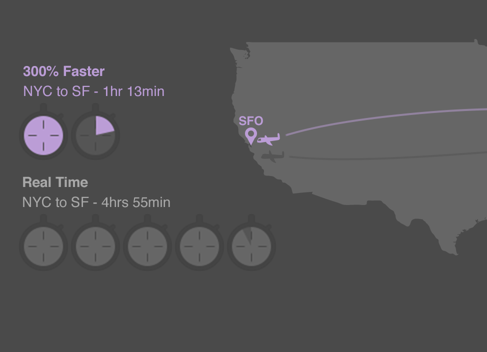 Nº2
Detail of an infographic using flying cross-country as a metaphor for Yahoo's improved click-through rate.
Nº2
Detail of an infographic using flying cross-country as a metaphor for Yahoo's improved click-through rate.
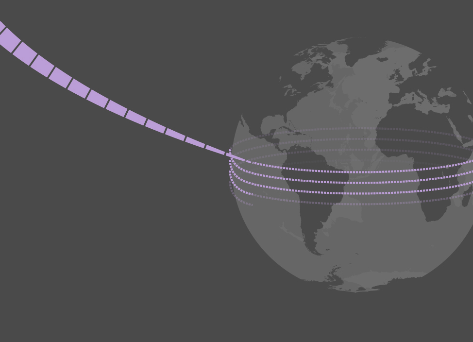 Nº3
Yahoo infographic detail.
Nº3
Yahoo infographic detail.
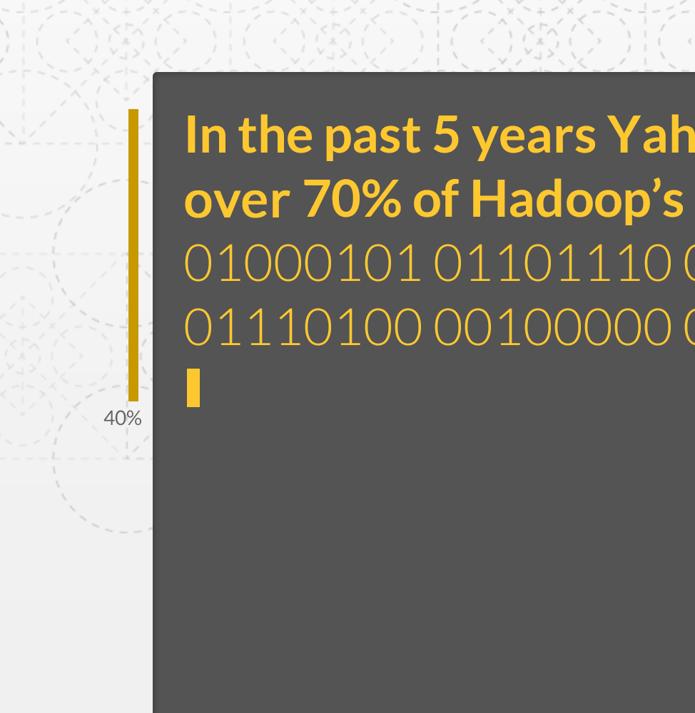 Nº4
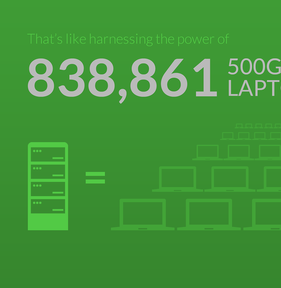
Detail from a paralax site promoting Yahoo's contributons to Hadoop.
Nº4
Detail from a paralax site promoting Yahoo's contributons to Hadoop.
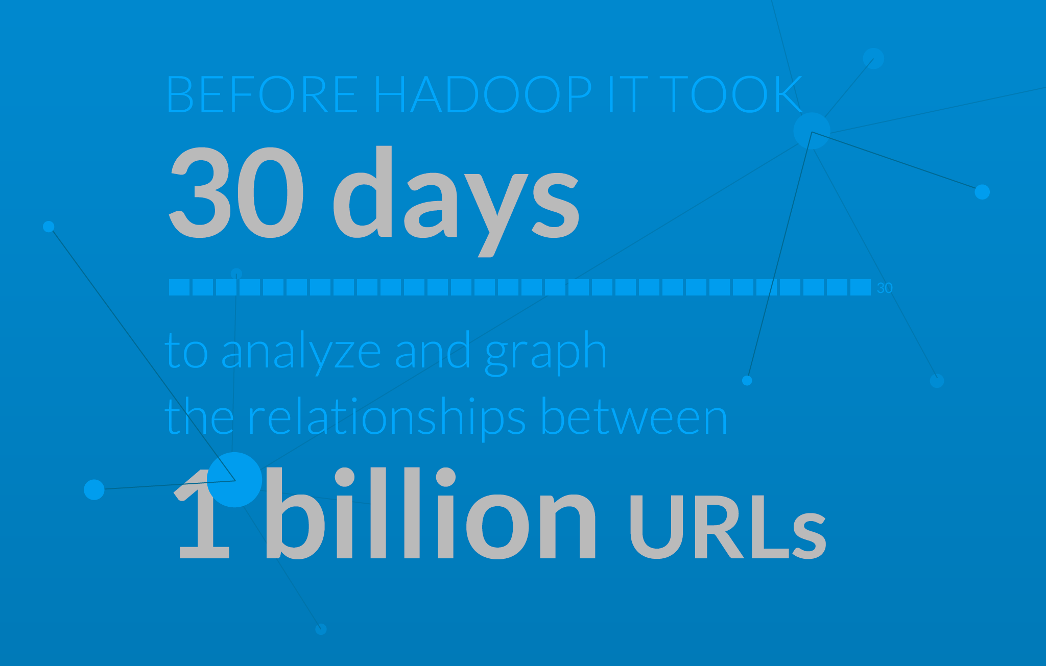
 Nº5
Detail from a paralax site promoting Yahoo's contributons to Hadoop.
Nº5
Detail from a paralax site promoting Yahoo's contributons to Hadoop.
 Nº6
Detail from a paralax site promoting Yahoo's contributons to Hadoop.
Nº6
Detail from a paralax site promoting Yahoo's contributons to Hadoop.

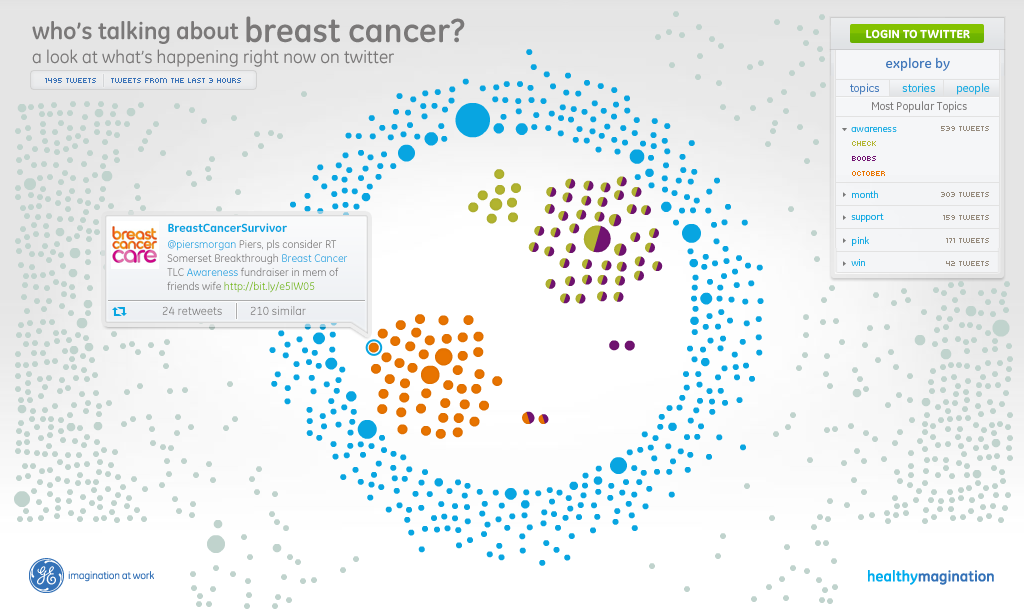 Nº1
Tweets are scaled by number of retweets, and color-coded based on topic filters.
Nº1
Tweets are scaled by number of retweets, and color-coded based on topic filters.
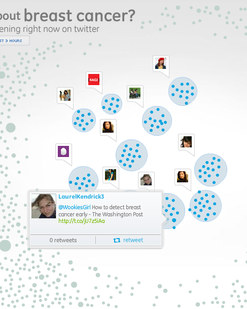 Nº2
Detail of people filter, grouping tweets by influential users.
Nº2
Detail of people filter, grouping tweets by influential users.
 Nº3
Detail of story filter, highlighting most linked stories.
Nº3
Detail of story filter, highlighting most linked stories.
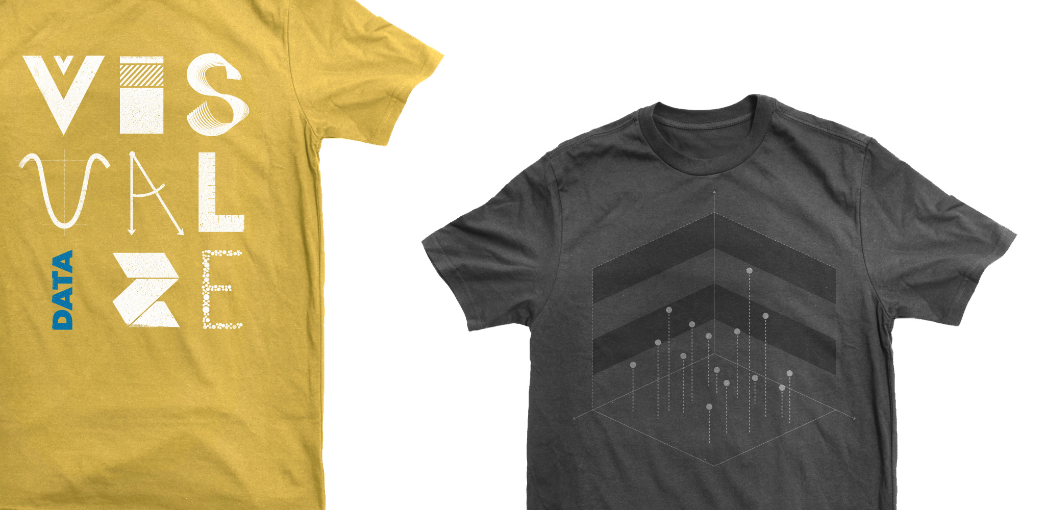 Nº1
T-shirts for Periscopic.
Nº1
T-shirts for Periscopic.
 Nº2
Marketing illustrations for Chartbeat.
Nº2
Marketing illustrations for Chartbeat.
 Nº3
Marketing illustration for Chartbeat.
Nº3
Marketing illustration for Chartbeat.
 Nº4
Marketing illustration for Chartbeat.
Nº4
Marketing illustration for Chartbeat.
 Nº5
Illustrations for Adaptu and Unicef while at Periscopic.
Nº5
Illustrations for Adaptu and Unicef while at Periscopic.
 Made in NYC
 Royals Pride

